2008年10月29日 星期三

Class Work 4


I would like to follow the principle of order to design these various outfits~~
Principle of order:
This principle suggests that colors should be based on an orderly plan. This might be an analogous color scheme, a contrasting color scheme, or a triadic color scheme. This principle also advocates using equal differences.
And I used the contrasting colour scheme.


My favourite 5 outfits:


2008年10月28日 星期二

Link: Group Research of Sonia Rykiel

Sonia Rykiel


Links to Analysis of Spring summer collection:


Links to Analysis of Fall winter collection:


Comparison:


About Sonia's Rainbow, please go to this link:


History:


ADs:


Others:


2008年10月24日 星期五

Sonia Rykiel --------- FW08


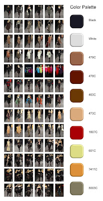
This year is the 40th anniversary of the brand of Sonia Rykiel. Candy colours were massly used in the Rykiel's collection of FW08. There are also some strange colour, e.g. brilliant pink, used to draw attention to the people~~

Hues: tertiaries
Intensity: mainly in low chroma
Value: tints

Sonia Rykiel --------- FW07


Hue: tertiaries and achromatic
Intensity: Low chroma
Value: tints

Same as the last few years, Rykiel is fond of using low chroma colour in Fall. In the collection of FW 07, she used red, olive beige and dark blue besides achromatic colour.

Sonia Rykiel --------- FW06


It's so interesting that Rykiel used blue tone again in the Fall/Winter 2006 collection. And she also used well in the achromatic colour.

Hue: tertiaries and achromatic
Intensity: Low intensity
Value: tones and shades

Sonia Rykiel --------- FW04


For Fall in 2004, Black and white still appeared in Sonia Rykiel's collection. However, this year we couldn't find blue shades any more, it changed to the autumn mood, mass of warm hues, brown, red and beige, were applied.

Hue: Tertiaries
Intensity: Low chroma
Value: Tints

Sonia Rykiel --------- FW03


In this collection, designer used black, white, shades of blue and beige to her outfits.


Hues: Tertiary colour


Chroma: mainly is low chroma, but there is 1 outfit which is high chroma for contrasting


Value: low value


2008年10月15日 星期三

Colour family

BCBG MAXAZRIA ADs
SS2008 COLLECTION


Balance of color


Variety of hue, light and dark values, and bright and dull intensities

all help to balance color schemes.


Emphasis of color


Advancing qualities of hue, value and intensity highlight a location

against receding qualities.


Alternation of color


Two colors changing back and forth in the same order lead the eye in the

direction of the regular exchange.


Sequence of color


Each color appears in a certain order to succession, keeps the same

position in each repeat, and leads the eye in the direction of progression.


2008年10月3日 星期五

Queen of Knitwear - Sonia Rykiel


F/W 2008 Collection


Colour Palette: Black, white, brilliant pink & Harmony tone(Candy-coloured): brown, pink, peach, yellow, light grey, pastel green, orange.


Though I'm not sure that the theme of this collection whether is "The swan" or not, I can see there is some features that can signify it. In the story of "The swan lake", there are two main roles - white swan and black swan, who represent positive and negative. I think that perhaps the designer may be inspirated from the story~~ Therefore, the main colour of this collection are black and white.
At the same time, since swan always gives us the feeling of gentle, sweet and fairy, therefore Rykiel would like to use the candy tone in this collection.
However, the reason why she use the brilliant pink to some outfits, I guess that it is because of the principle of novelty. In this principle, although people like harmoniours or balanced colour schemes, harmony quickly becomes boring. As a result, a new or unexpected combination wil draw attention to itself and make the entire composition more pleasing and harmonious.