2008年9月28日 星期日

Class Work 3


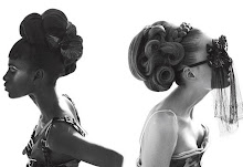
To colour the following ffashion boutique by applying colour theories and principles:


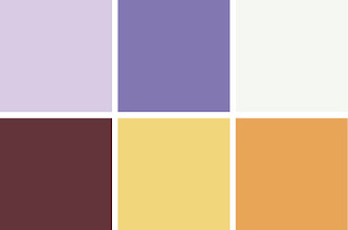
Alternation of color :

Two colors changing back and forth in the same order lead the eye in the direction of the regular exchange.


Harmony of color

Agreement of feeling is easier when advancing or receding qualities of hues, values and intensities convey similar moods, giving enough variety for interest but avoiding boredom or conflict.


2008年9月20日 星期六

Class Work 2


This is the 2nd class exercise~

After studying the Colour Harmony,

I found that actually there are a lot of principle to guide us for colour combination.

By understanding what makes one combination of colours pleasing and another combination of colours unattractive can be difficult to comprehend.

Colour, like beauty, is very much in the eye of the beholder, there are no fixed principles of colour harmony.

There are, however, general guidelines that can help the novice until a level of expertise is reached.

The most important factor to determine the colour combination is pleasing.

In these collection, I used the principle of familiarity.

This principle is based on the concept that familiarity is pleasing and readily accepted.

As a result, colour schemes based on nature will seem pleasing to most people.

Class work 1


This is the first class exercise~~

In this collection, I use blue, violet , grey and white.
They are in high chroma intensity and low value.
These cool colours can give cool and fresh feelings in the summer time~~